Around The World of Curry
- Product Packaging Development
Japanese curry has a fascinating journey that began when it was introduced to Japan in the 1870s, brough along with other Western foods as Japan opened its ports to international trade. Originating from India, curry adapted uniquely to Japanee tastes and has since become a staple in Japanese cuisine, loved for its rich, savory flavor, and comforting warmth. In recent decades, Japanese culture has significantly influenced Indonesia, with an increasing appetite for Japanese fashion, music, anime, manga, and notably culinary delights. Japanese cuisine, in particular, gained widespread popularity in Indonesia which has become a favorite among food enthusiasts.
Recognizing this trend, Sasa Indonesia sought to tap into the market by partnering with House Foods Group, a renowned Japanese brand with a rich history dating back to 1913. The collaboration aimed to create a product that combines the authenticity of Japanese curry with the practicality desired by Indonesian consumers. The result is the Sasa House Kari Jepang, a ready-to-eat curry product that offers the autentic taste of Japanese curry at an affordable price, packaged for convenience and practicality.
EGGHEAD was tasked with developing the product packaging for this new product line, ensuring it communicated the blend of Japanese and Indonesian cultures and mad the product accessible and appealing to the Indonesian market.
Your Passport to Cultural Delights
- Cultural Integration
Creating a packaging that authentically represents Japanese culture while resonating with Indonesian consumers. - Market Penetration
Differentiating the product in a competitive market and aking it appealing to a wide audience. - Practicality and Appeal
Designing packaging that is both and practical for everyday use and visually appealing to attract local consumers in Indonesia.
From The Heart of Japan to The Homes of Indonesia”
Catalog, The League of Intrigue
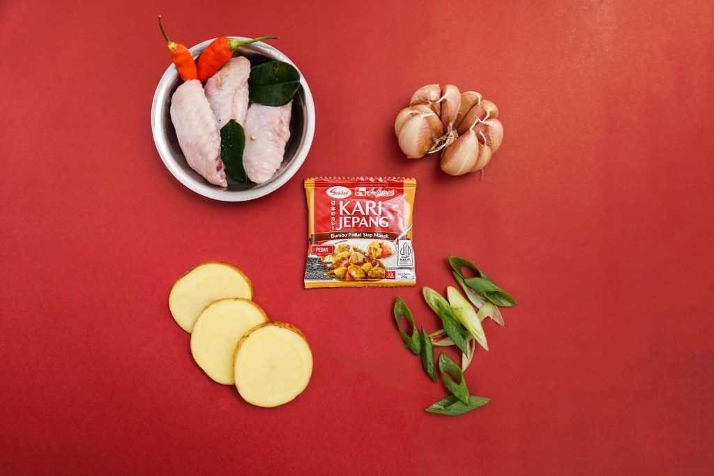
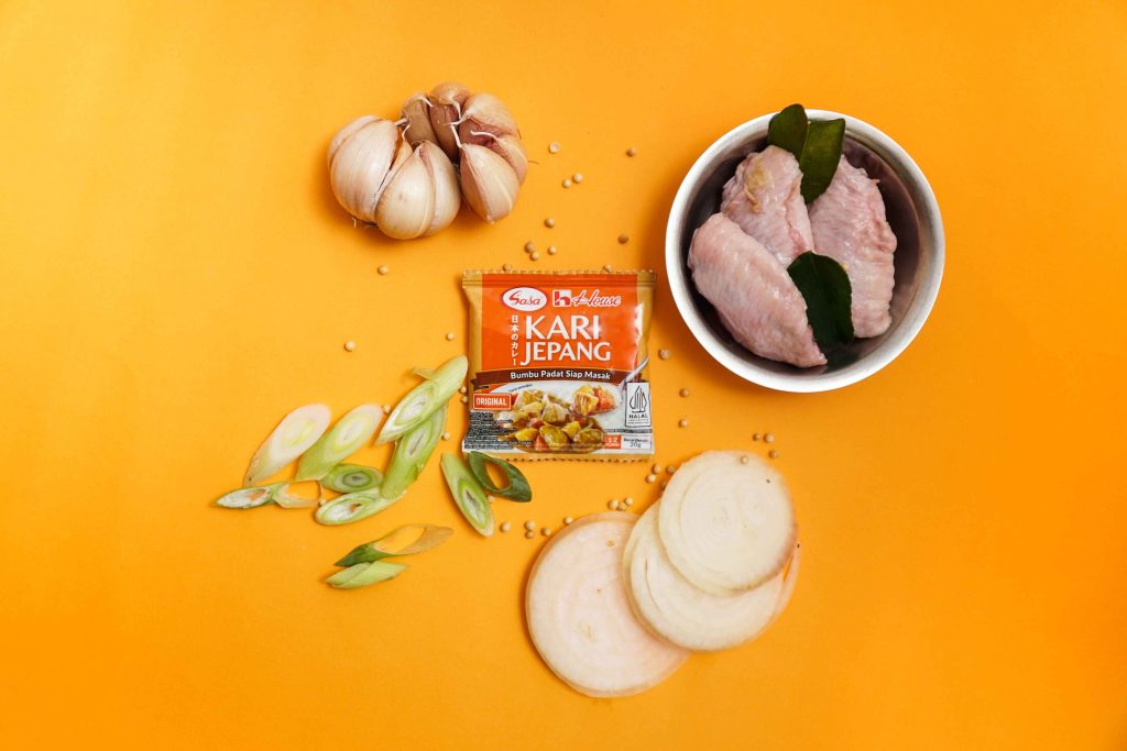
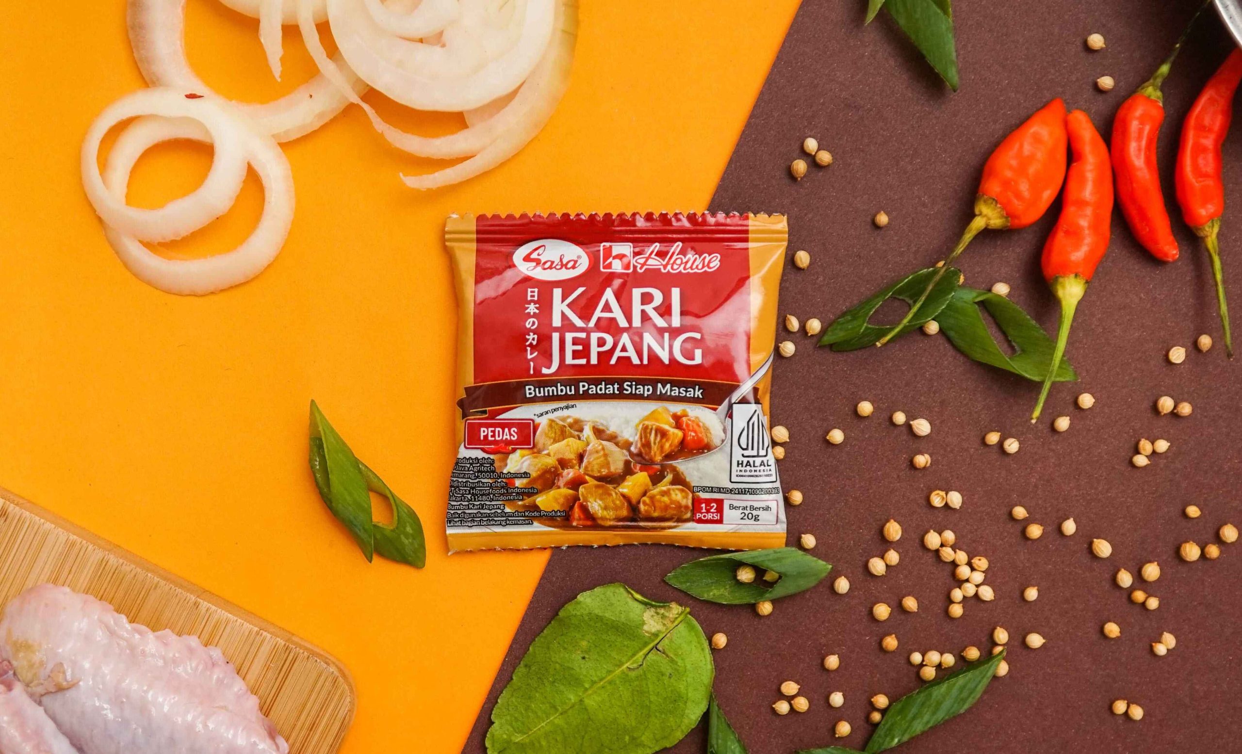
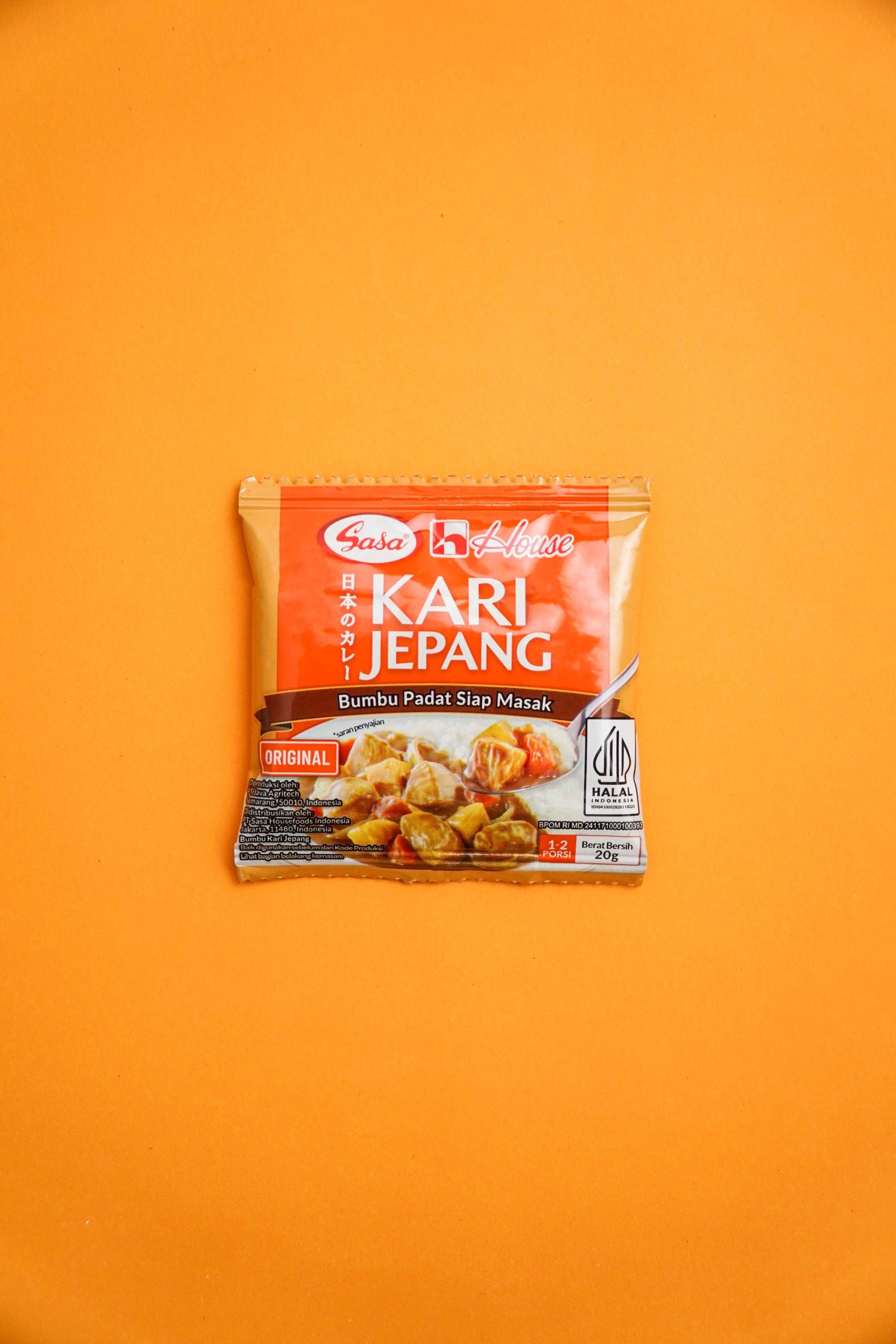
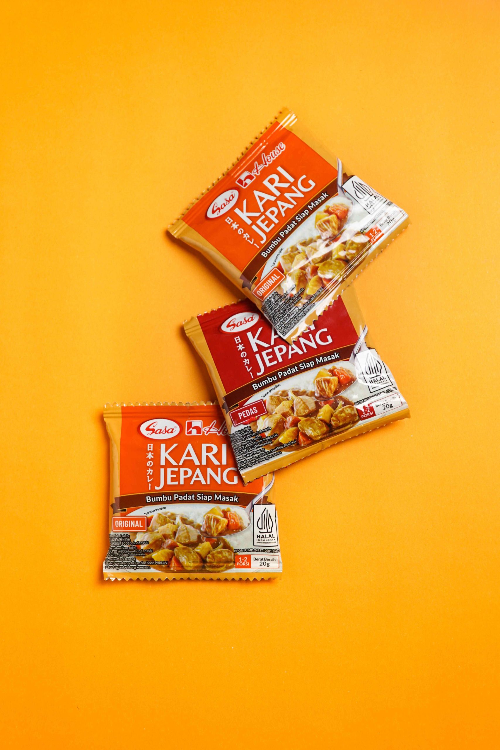
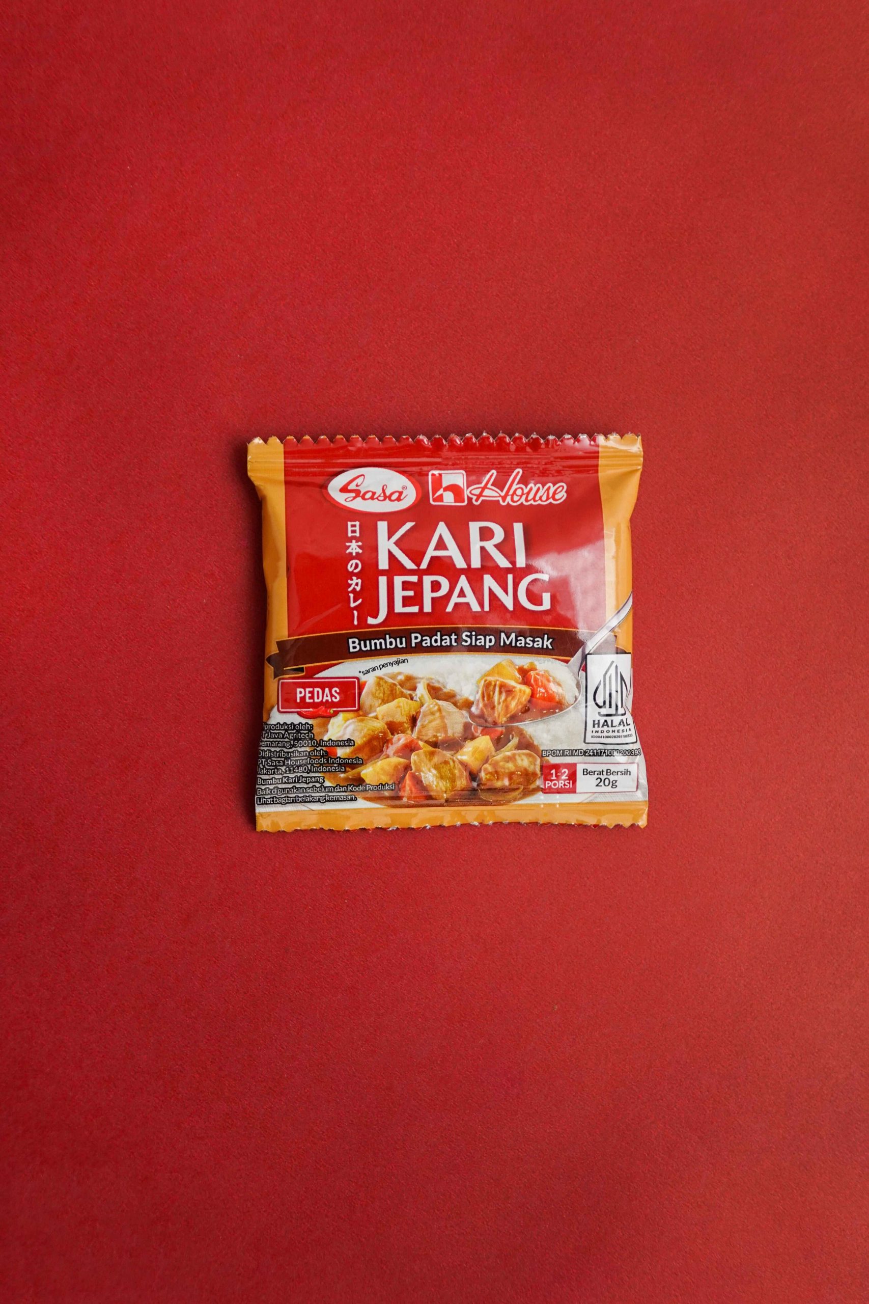
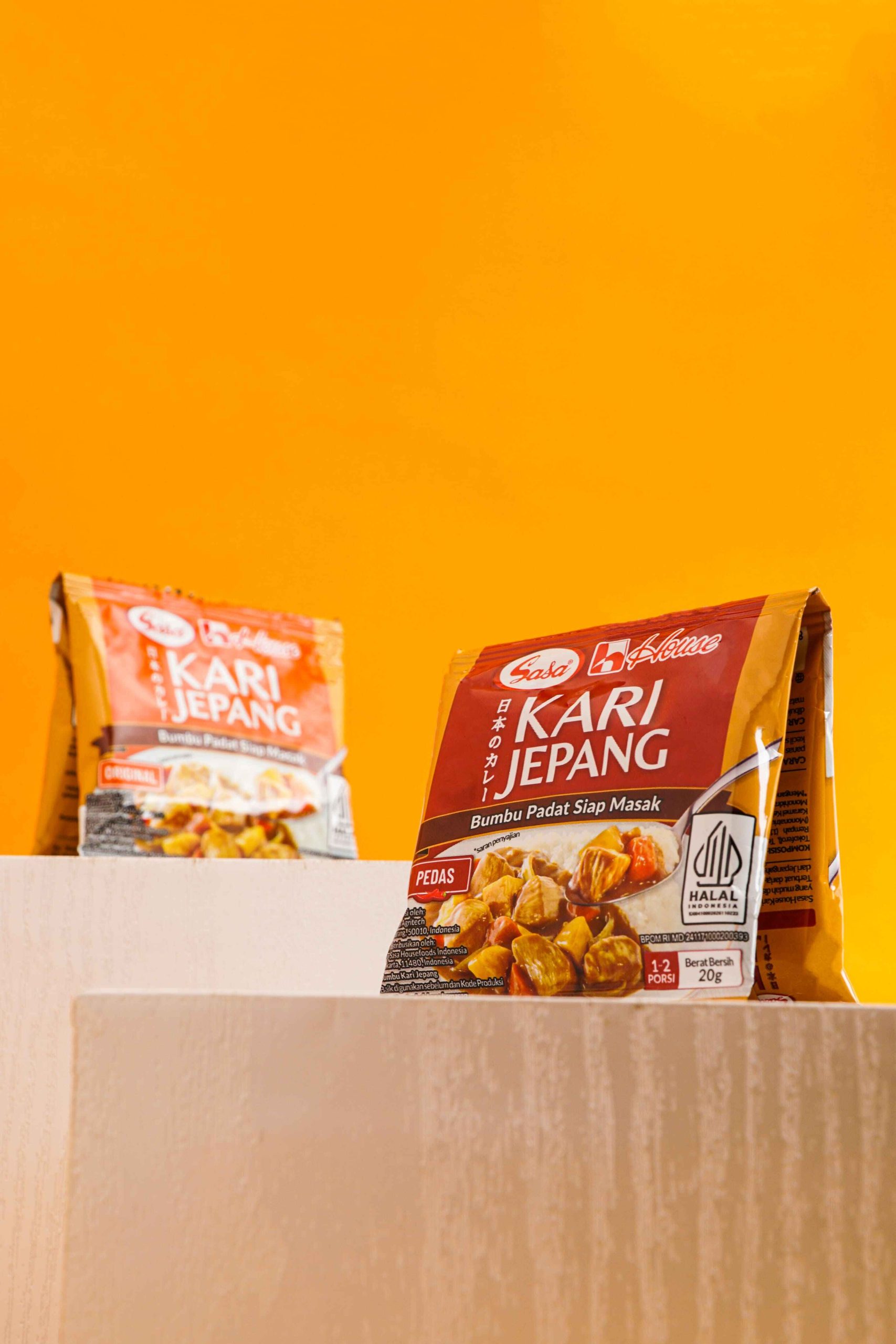
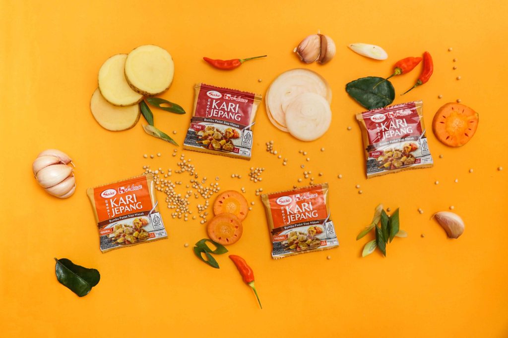
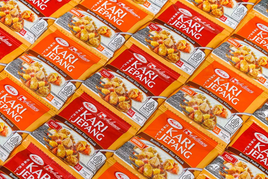
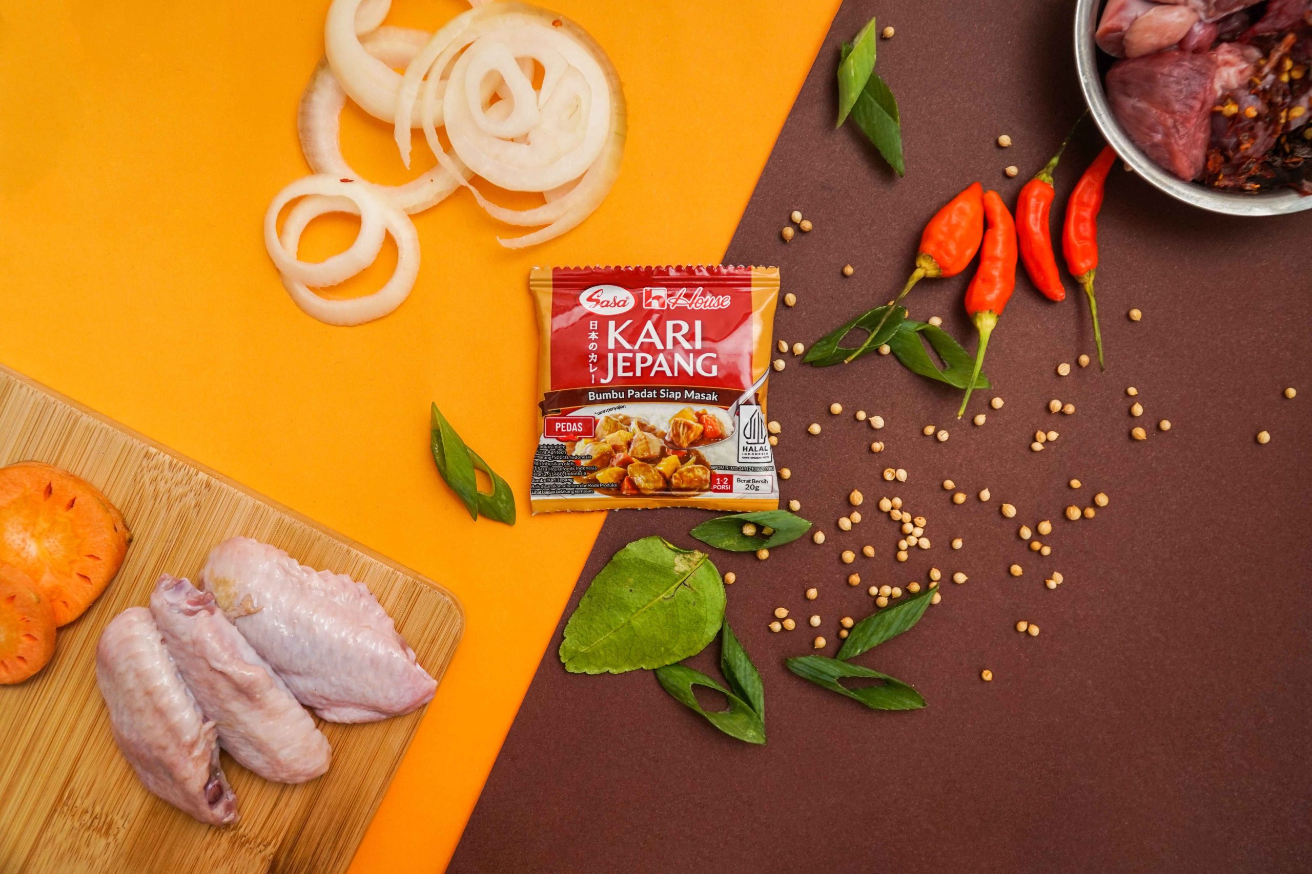
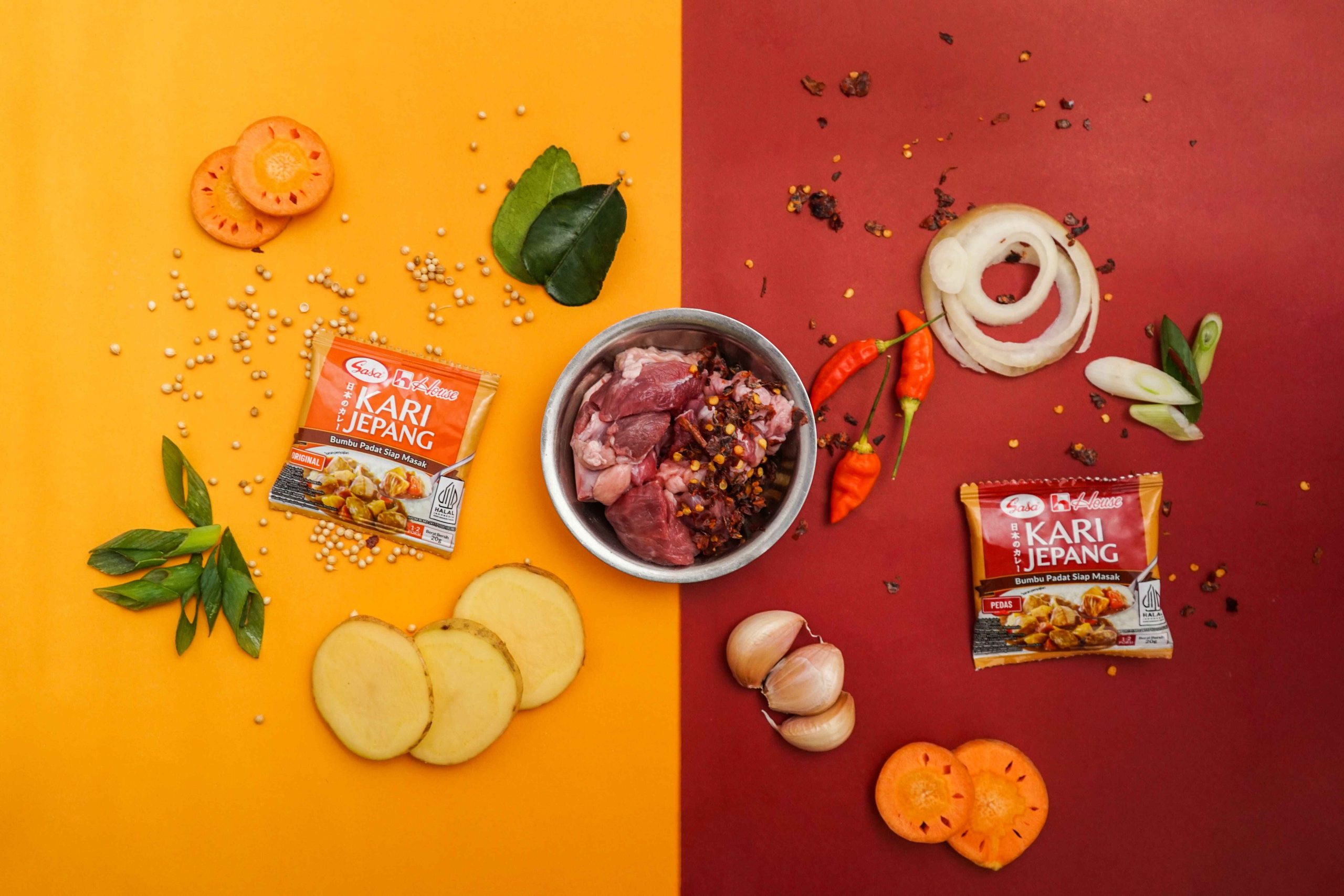
EGGHEAD took the challenge on the packaging development for Sasa House Kari Jepang with a focus on cultural integration, practicality, and visual appeal. We designed the packaging to incorporate the element of Japanese writings next to the brand product line name, this subtly highlights the product’s Japanese origins, making it recognizable and authentic. The packaging features vibrant and appetizing images of the curry, showcasing its rich and hearty texture of the dishes. This visual strategy is aimed at stimulating the appetite and conveyinng the delightful appeal of the product at first glance. Understanding the busy lifestyle of any Indonesia consumers, we emphasized the convenience of the product through clear and concise packaging. The spice levels and a concise description of the product are prominently displayed. The packaging is designed to be easy to use and store, reflecting the product’s practicality a a quick ready-to-eat curry sachet. Additionally, to emphasize the collaboration between Sasa Indonesia and House Foods, the packaging includes logo from both companies. This not only builds trust but also highlights the cross-cultural partnership, appealing to consumers who appreciate Japanese cuisine.
