SAYAP SUCI: Never Stop Flying
Sayap Suci is the coffee brand of Holywings Group, serving coffee and entertainment under one roof. EGGHEAD Branding Agency built its visual identity and carried it across every cup, can and bag, so a brand born in nightlife could stand on its own in daylight.
A Logo with Wings
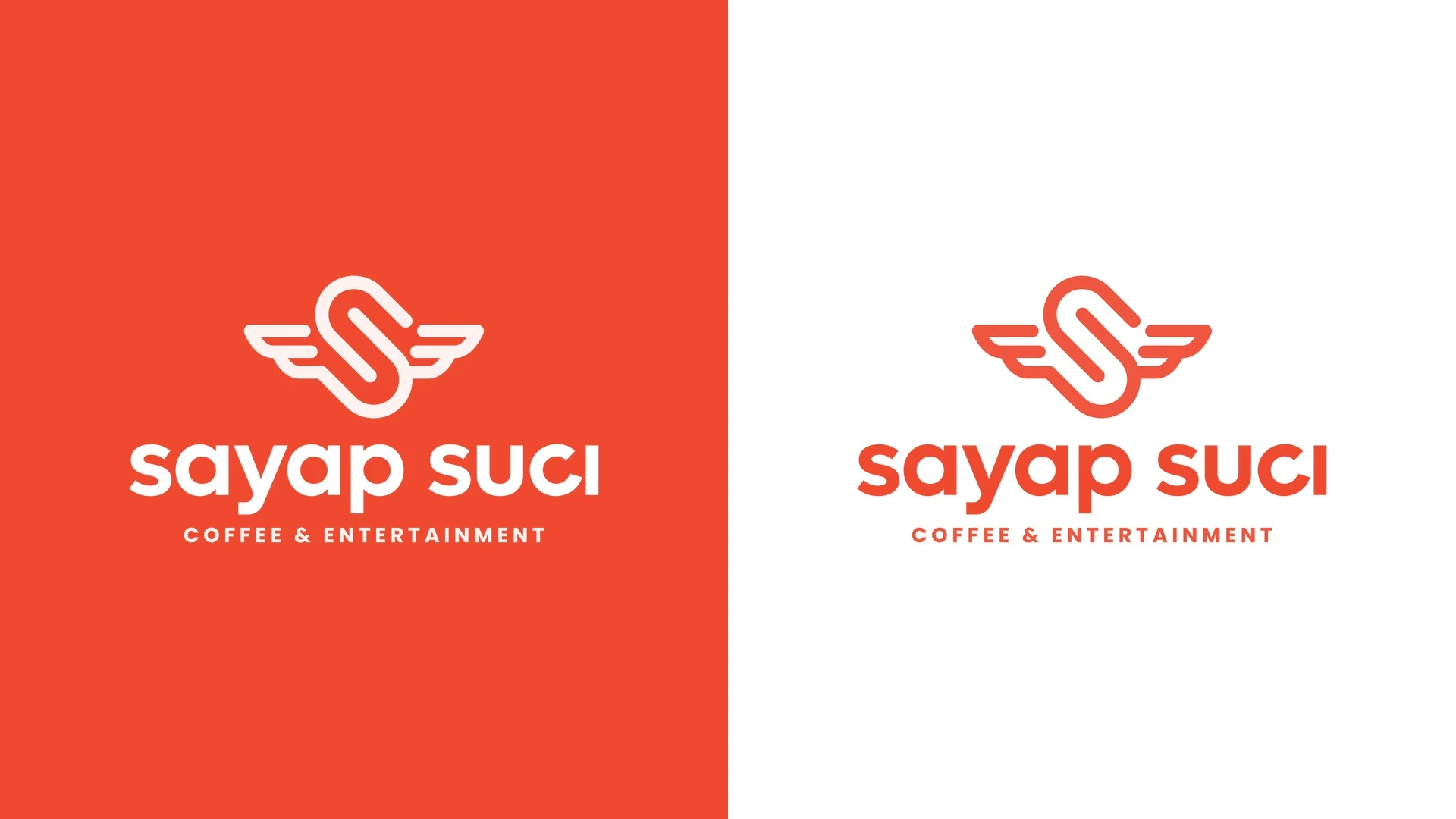
The name means "holy wings", so we gave the S a pair of them. The logogram is drawn as one continuous line that folds into an S and opens into wings, paired with a lowercase wordmark whose letterforms we modified for a more dynamic, friendly feel. The tagline Never Stop Flying keeps the energy of the parent brand.

Loud on Every Cup
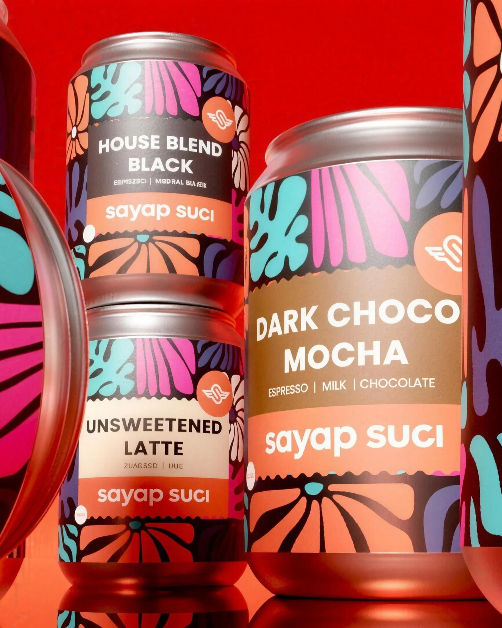
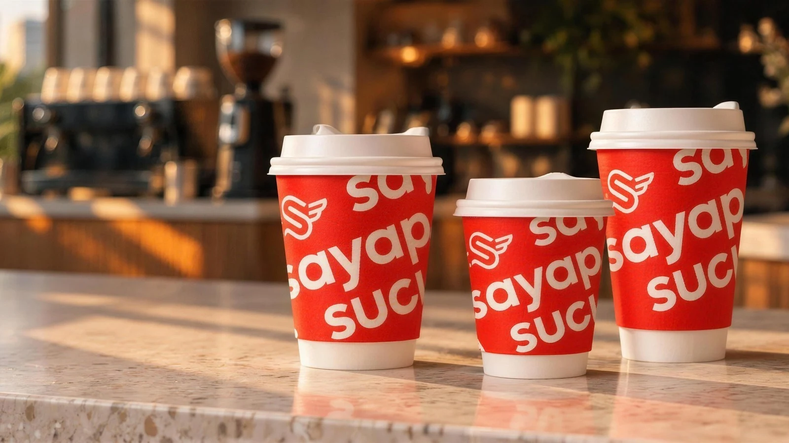
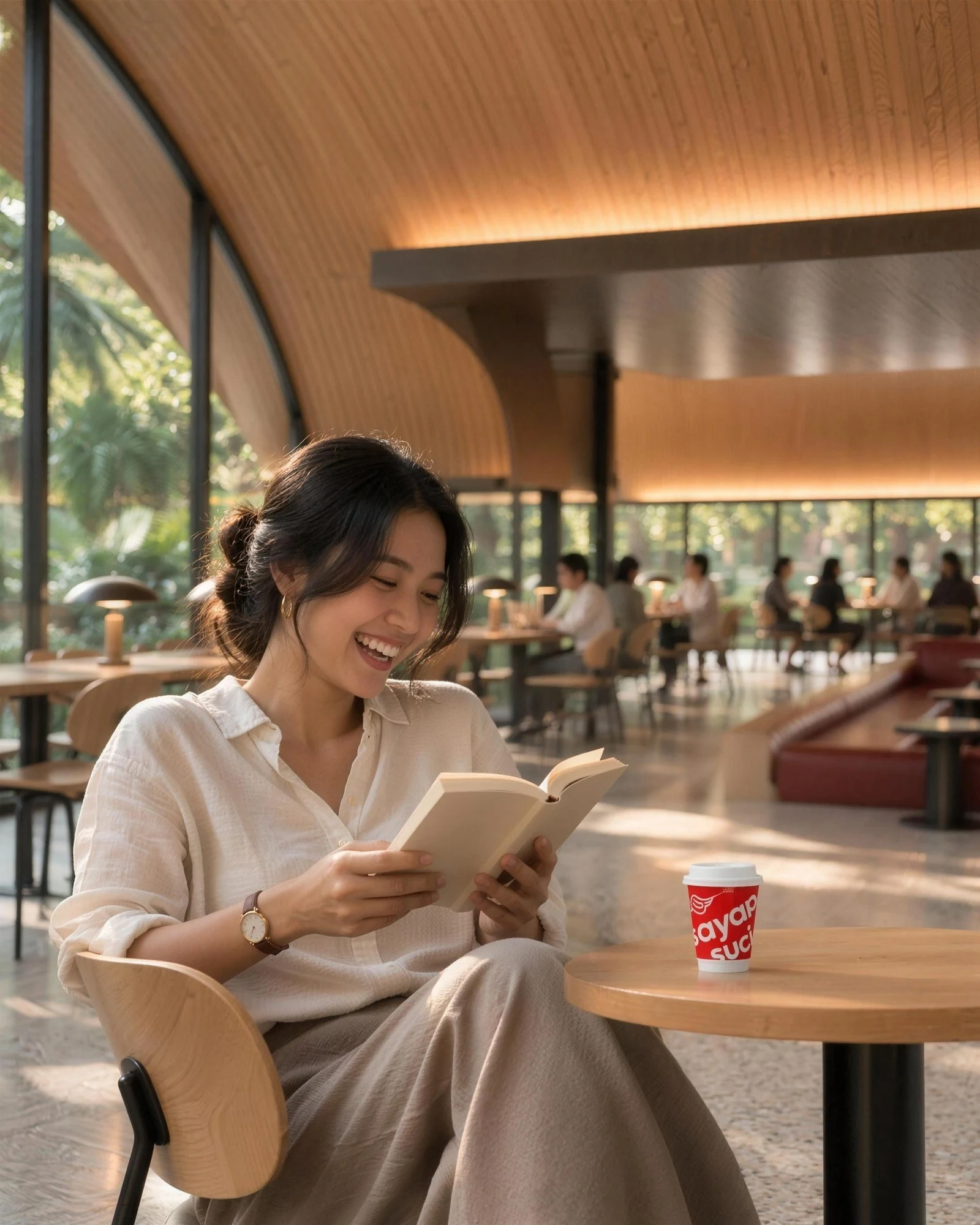
Set at an angle and repeated edge to edge, the wordmark becomes the pattern: white on bold red for hot cups, red on white for cold cups. The same system stretches to canned coffee with a playful botanical illustration, House Blend coffee bags and merchandise, so every touchpoint is recognisable from across the room.
BRAND IDENTITY
Logotype, logogram, logo configuration, colour and a geometric playful mastergraphic.
PACKAGING DESIGN
Hot cups 8 oz and 12 oz, cold cups, canned coffee and House Blend coffee bags.
BRAND IMPLEMENTATION
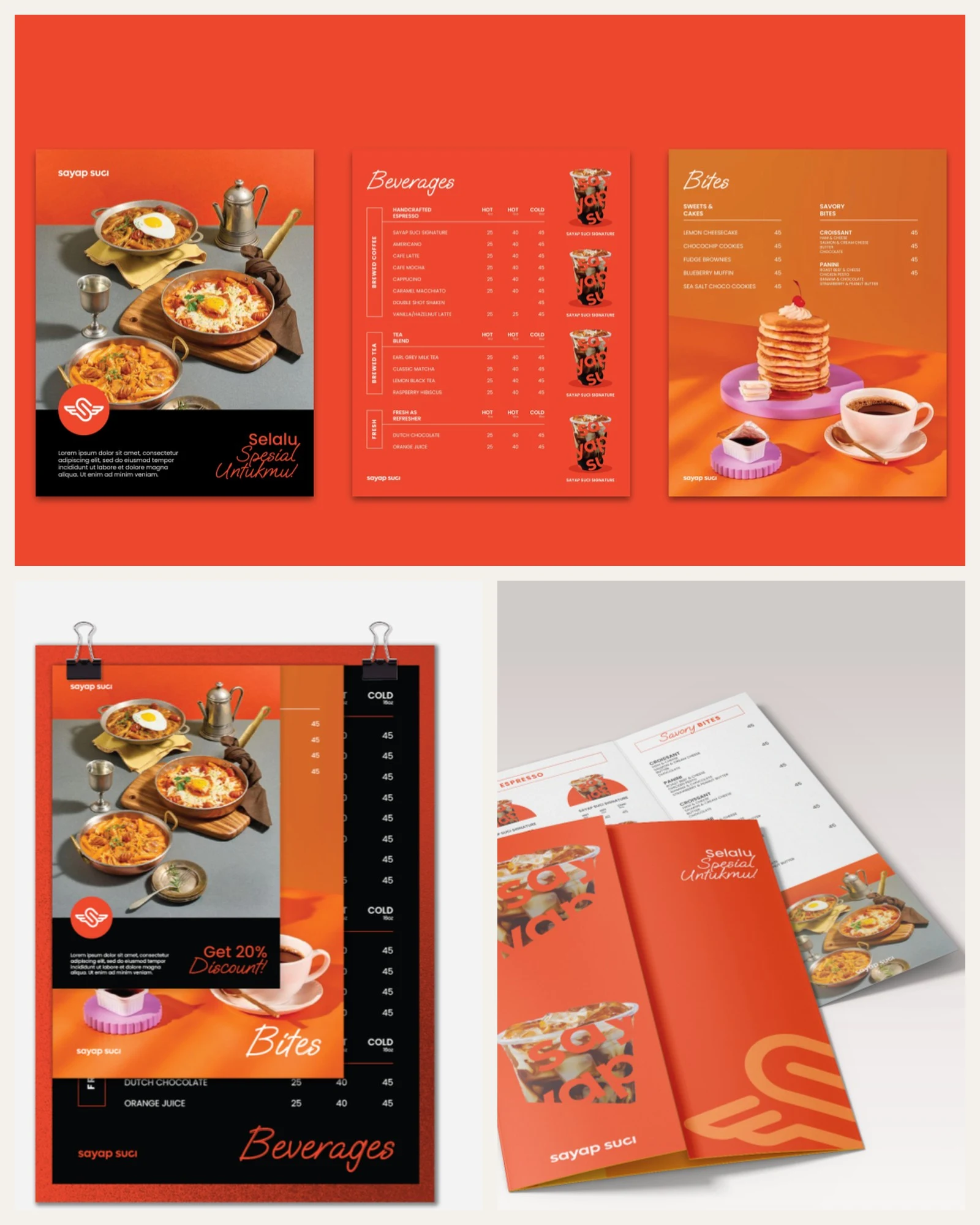
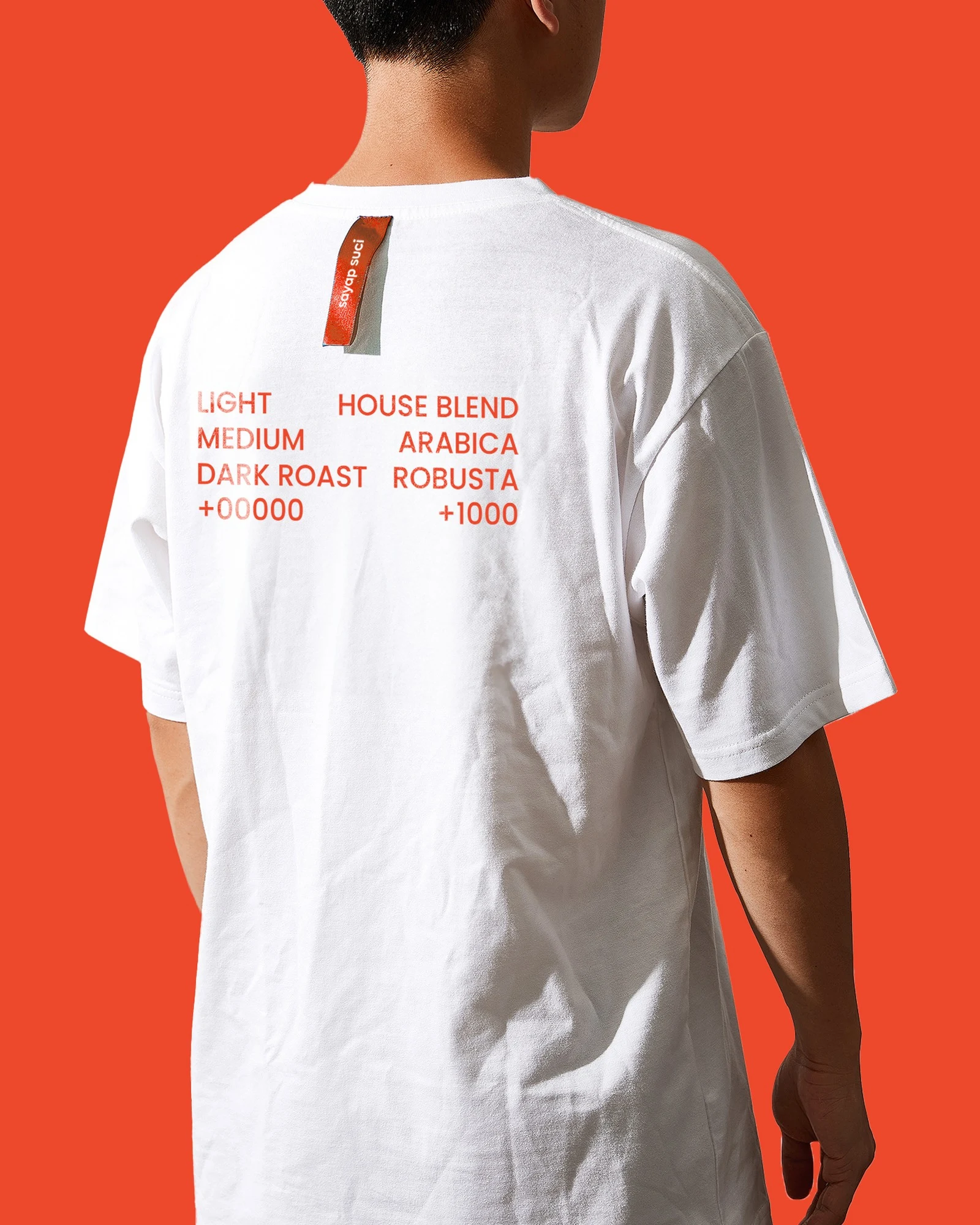
Menu, paper bag, merchandise and social media templates.