Astra Property is a leading real estate developer under the Astra Group, shaping residential, commercial, and mixed-use developments across Indonesia. With a legacy rooted in trust, precision, and long-term value, Astra Property plays a key role in building spaces that move people, businesses, and cities forward.
As Astra Property continued to grow its portfolio, the brand faced a familiar challenge of scale. While its developments were widely recognized, the corporate identity itself needed a clearer, more consistent presence across touchpoints. Egghead was engaged to bring structure to Astra Property’s vision, strengthening clarity through a cohesive visual system that could scale with confidence.
Brand Audit & Strategy
We began by understanding Astra Property’s role within the larger Astra ecosystem and mapping how the brand was perceived across internal and external touchpoints. The audit revealed a strong foundation, but also the need for a clearer system that could unify expression without losing heritage.
Visual Identity & Logo Refinement
Rather than redesigning for novelty, the logo evolution focused on refinement. Key visual cues were retained to honor Astra’s credibility, while form, proportion, and symbolism were enhanced to reflect a more future-oriented outlook. The result is a mark that feels grounded yet dynamic, designed with intention in every line and ratio.
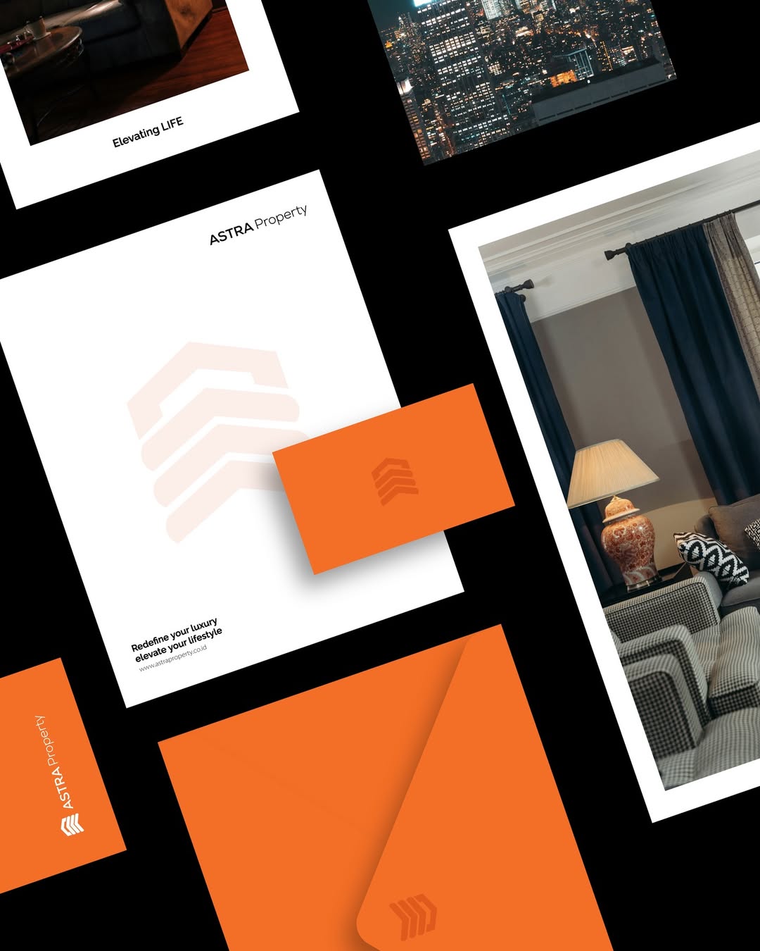
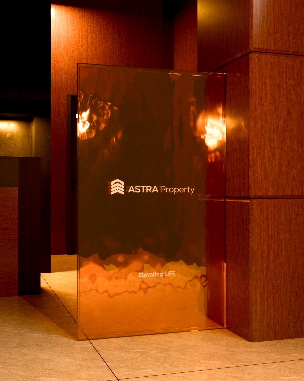
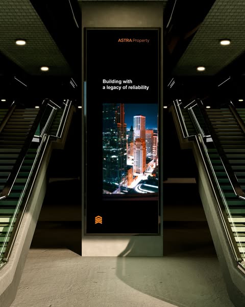
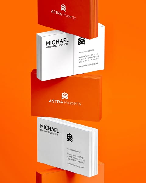
Activation & Corporate Identity System
Beyond the logo, we developed a complete visual framework that lives across real-world applications. Formal yet modern typography, a calm and confident color palette, and graphics inspired by architectural rhythm ensure consistency from signage to screens. Every element was designed not just to look good, but to work hard wherever the brand appears.
Through this transformation, Astra Property’s identity now speaks with purpose and clarity. Not built in files, but in everyday interactions. A system that builds trust, one touchpoint at a time.