Brand Audit & Strategy
Through research and site immersion, we discovered a whitespace in the market for teppanyaki that feels intimate yet elegant. Raku’s positioning was built around this insight, a modern take that celebrates craftsmanship, performance, and the emotional spark of togetherness.
Visual Identity & Implementation
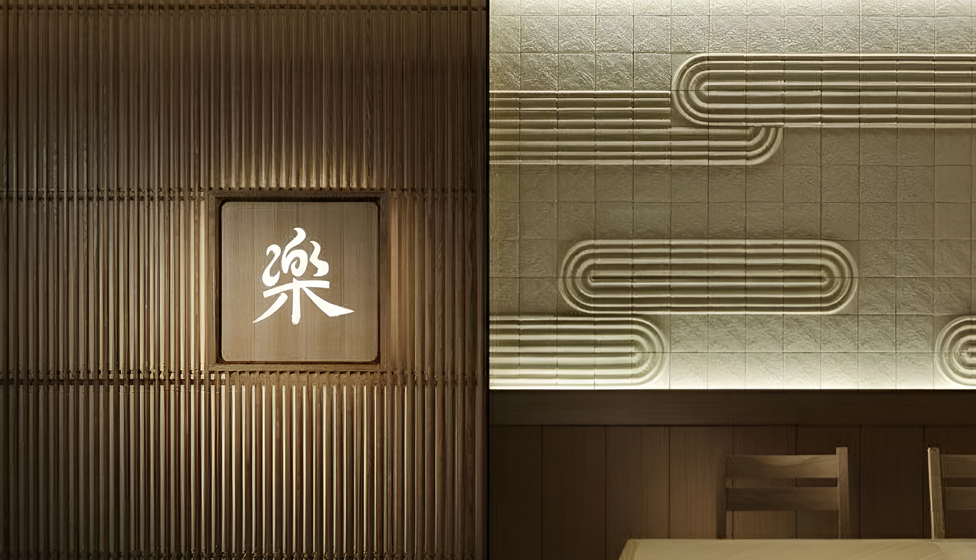
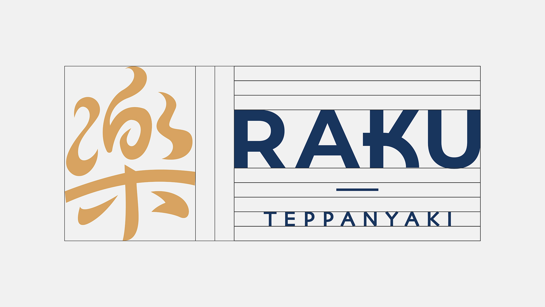
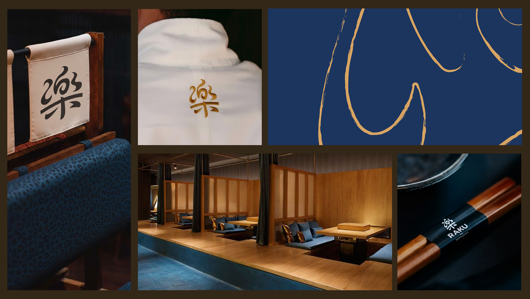
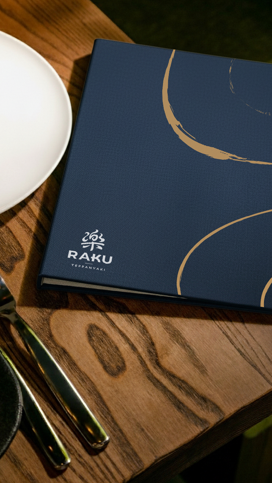
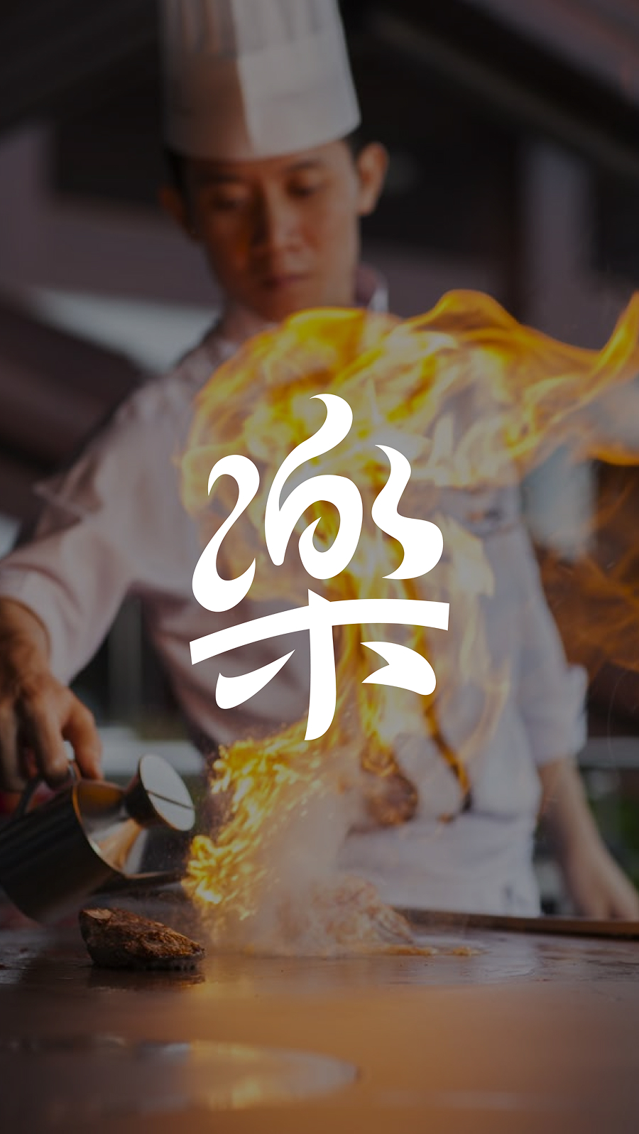
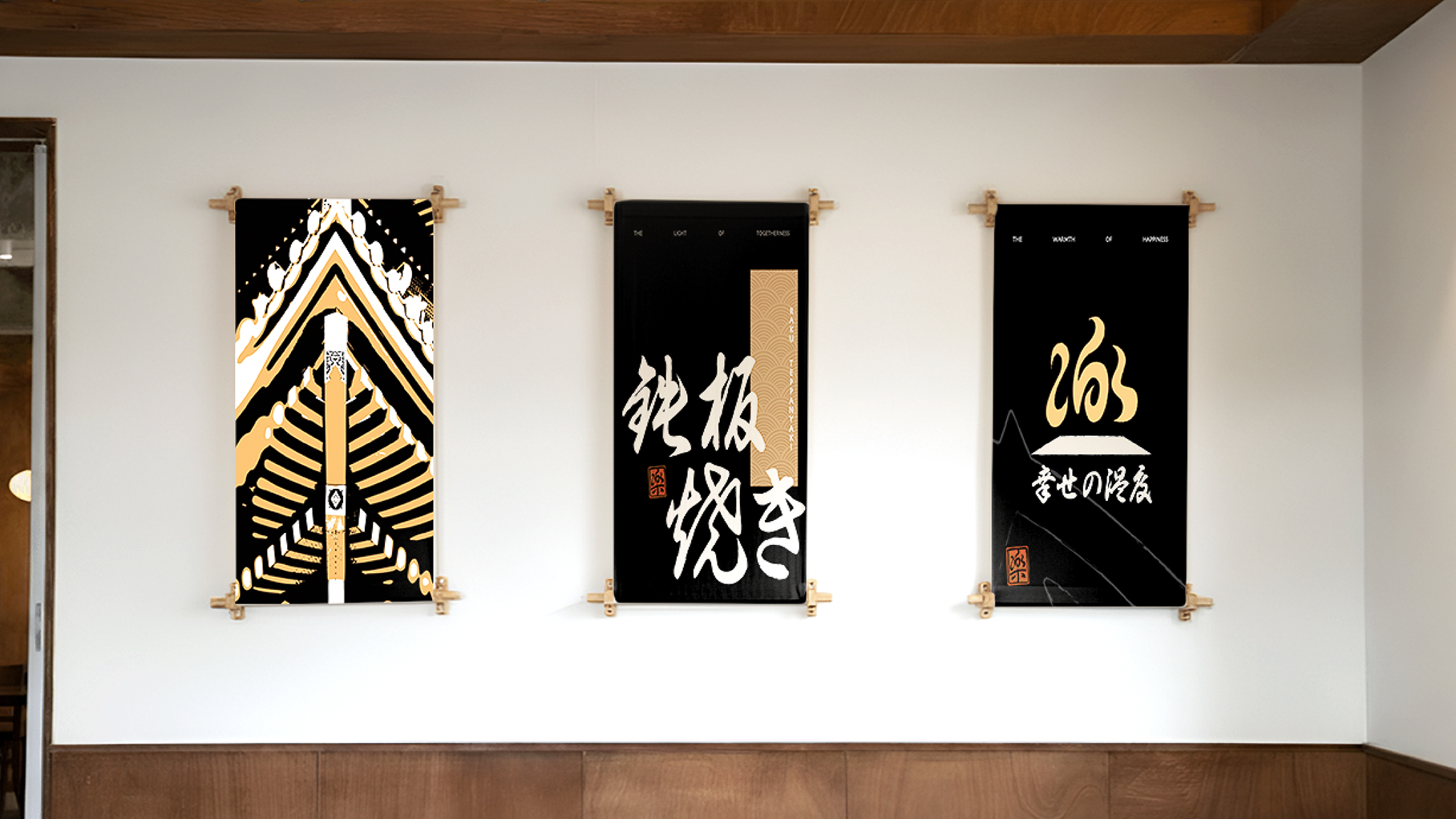
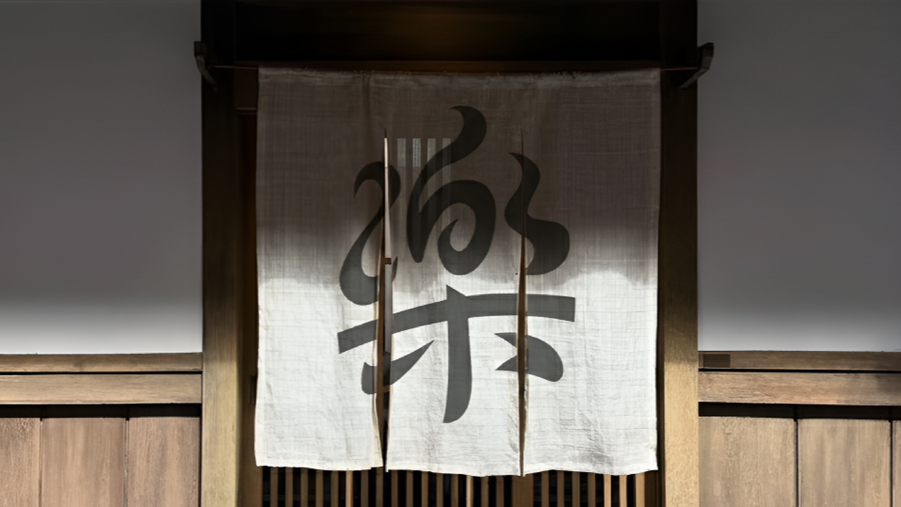
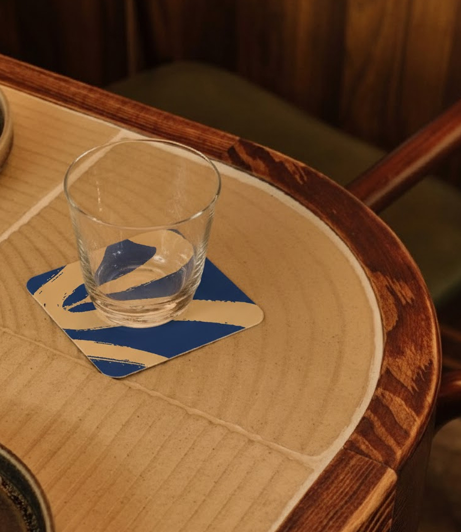
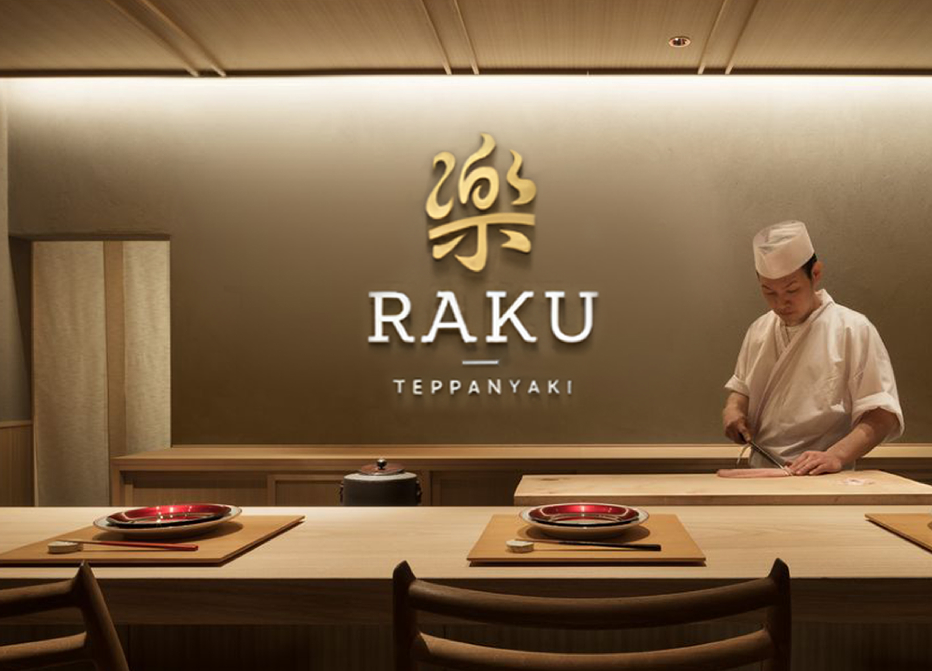
At the heart of the brand lies a symbol that embodies its essence- a modern interpretation of “Raku,” meaning happiness. The logo unites three elements: fire, the teppan’s rectangular form, and a kanji inspired mark representing joy. With sleek geometry and warmth in tone, it becomes both a statement and a feeling. Egghead expanded this across signage, uniforms, menus, packaging, and interiors, ensuring every detail resonates with refined authenticity.
Activation & Experience
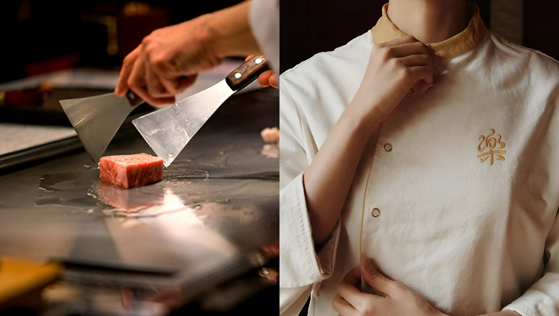
From the glow of the grill to the glow of the logo, Raku’s story unfolds across every touchpoint. Egghead helped the brand express that connection between heat and heart- where every flame tells a story, and joy takes shape, one teppan at a time.